Competitor review
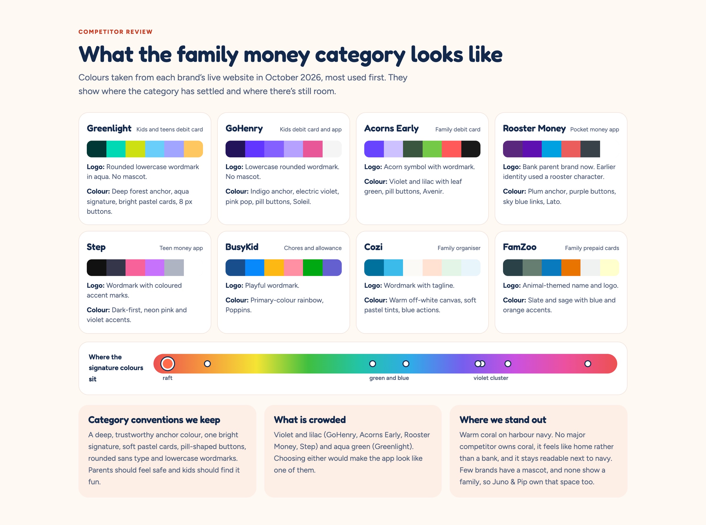
Eight family-finance brands mapped by colour and logo style to find what the category expects and where there was room.
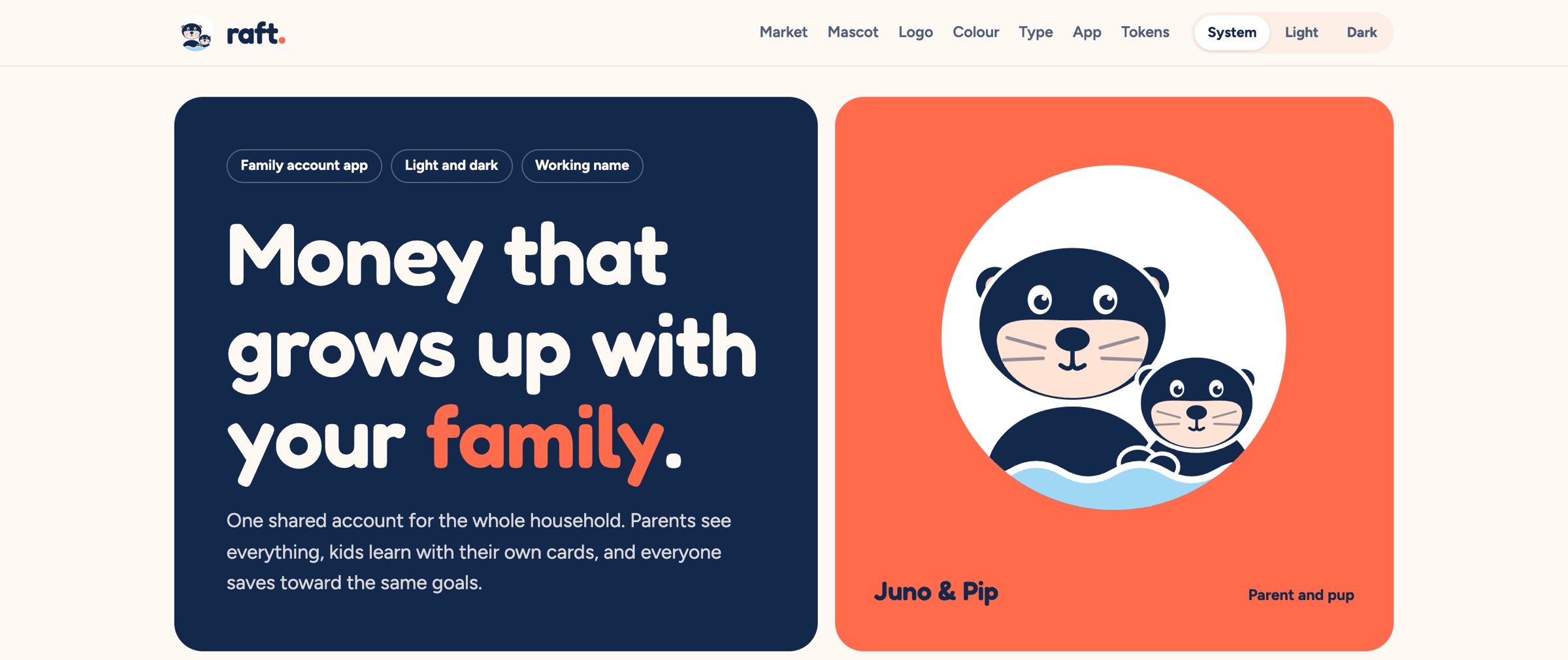
Brand identity for Raft, a family finance app: Juno and Pip, an otter parent and pup holding paws, a rounded lowercase wordmark with a coral dot, and a harbour-navy palette that works in light and dark.
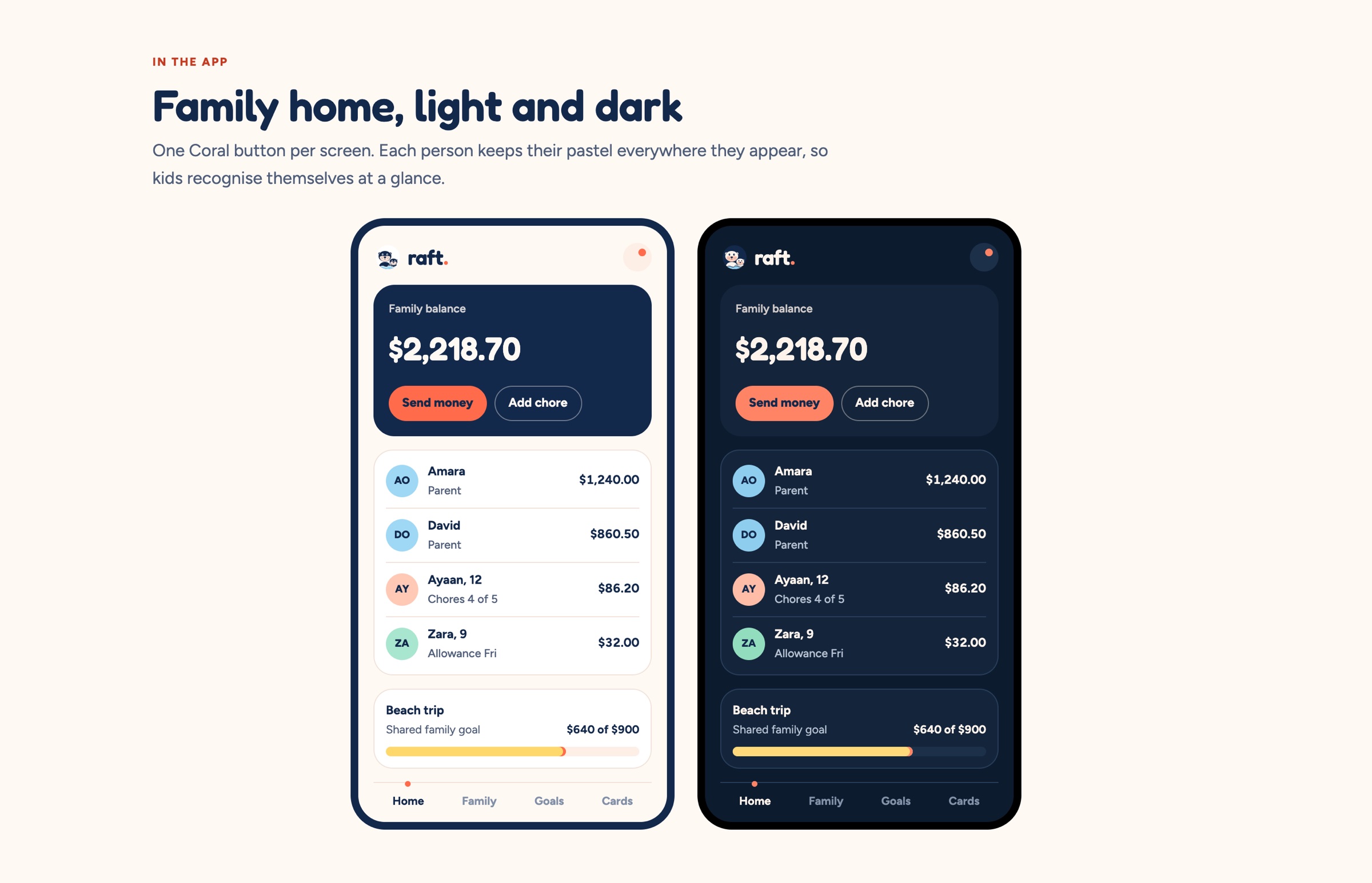
Family money apps either look like a bank or like a kids’ toy. Raft had to be trusted by parents and still feel warm to the rest of the family. A group of otters floating together is called a raft, which gave the name and the mascot: Juno and Pip, a parent and pup holding paws so they don’t drift apart. Navy carries the trust; one coral action per screen and four pastels give each person their own colour.
Eight family-finance brands mapped by colour and logo style to find what the category expects and where there was room.
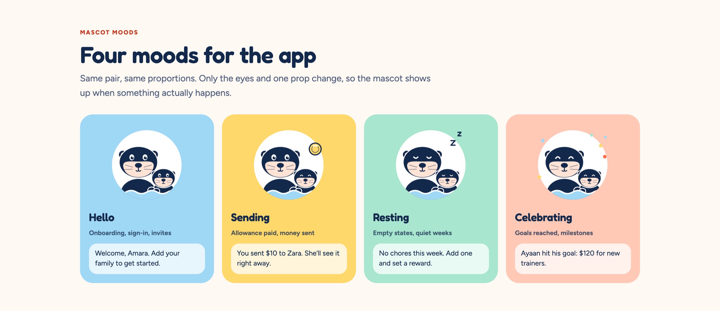
An otter parent and pup with four moods — hello, sending, resting and celebrating — that appear only when something actually happens.
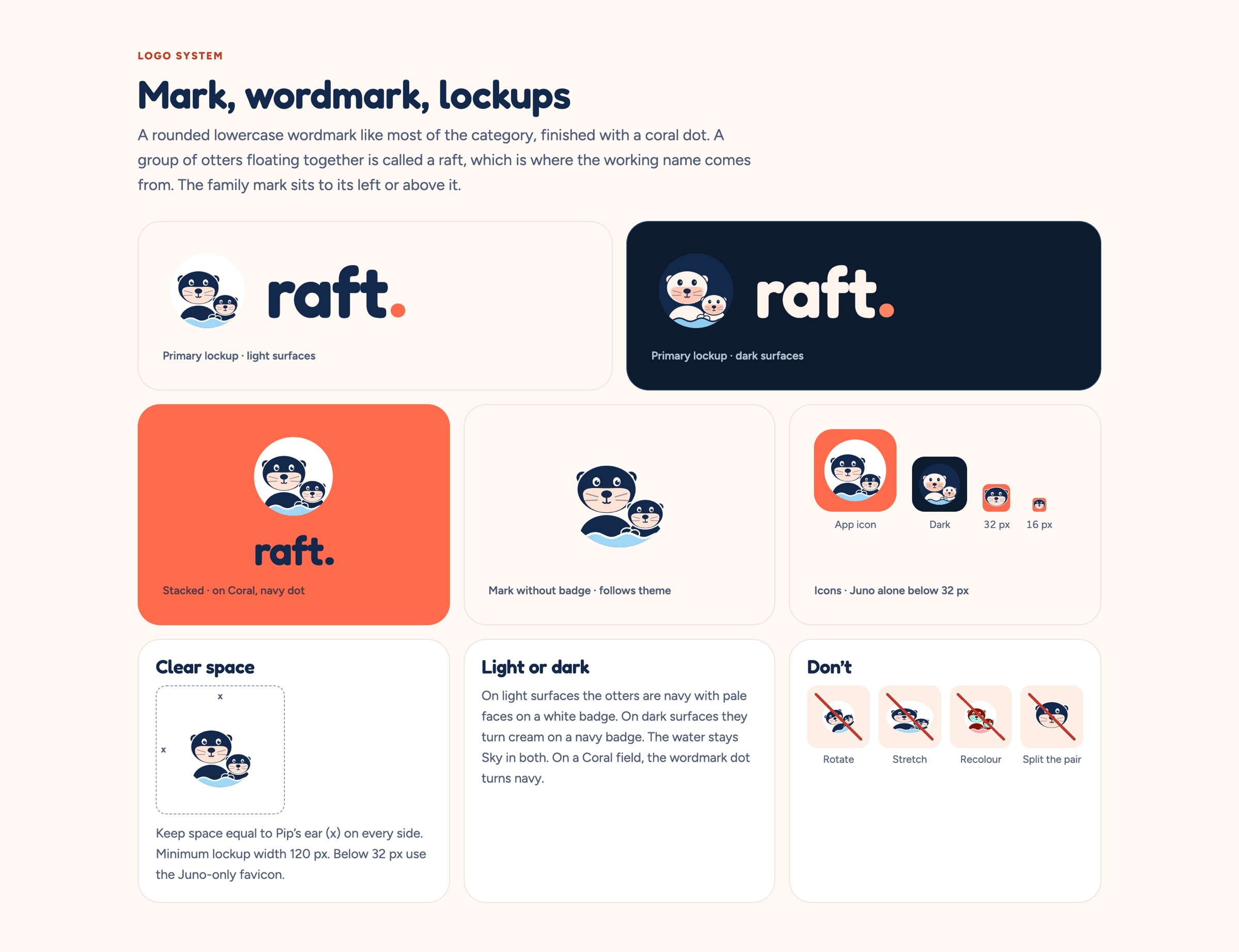
A rounded lowercase wordmark finished with a coral dot, in horizontal, stacked and icon-only versions for light and dark.
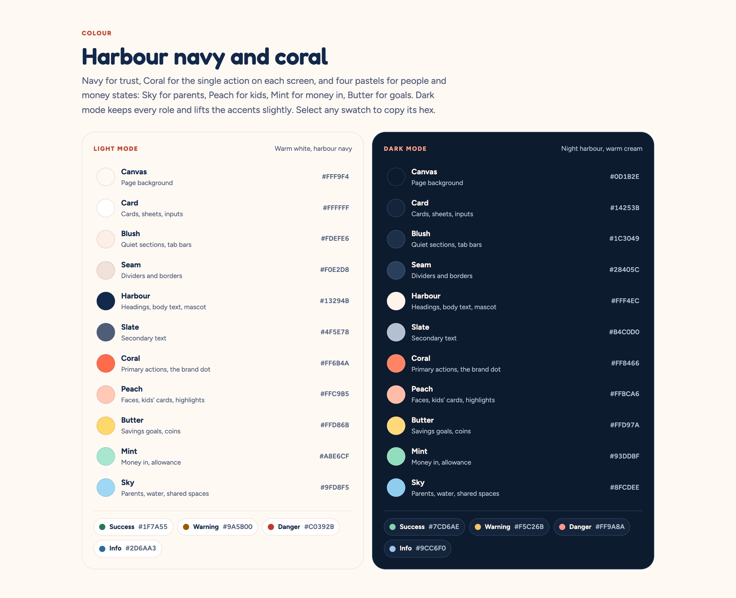
Navy for trust, coral for the single action on each screen, and sky, peach, mint and butter for parents, kids, money in and goals.
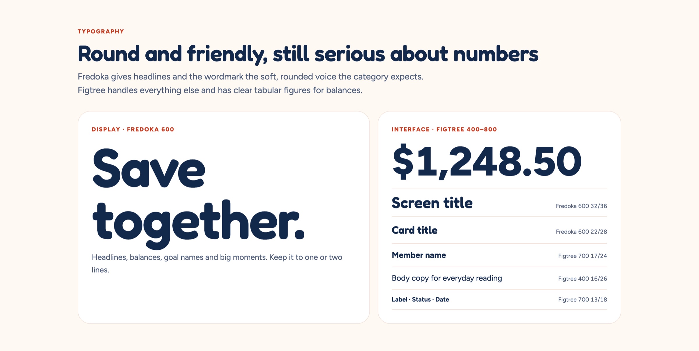
Fredoka for headlines and big figures, Figtree for the interface with clear tabular numbers.
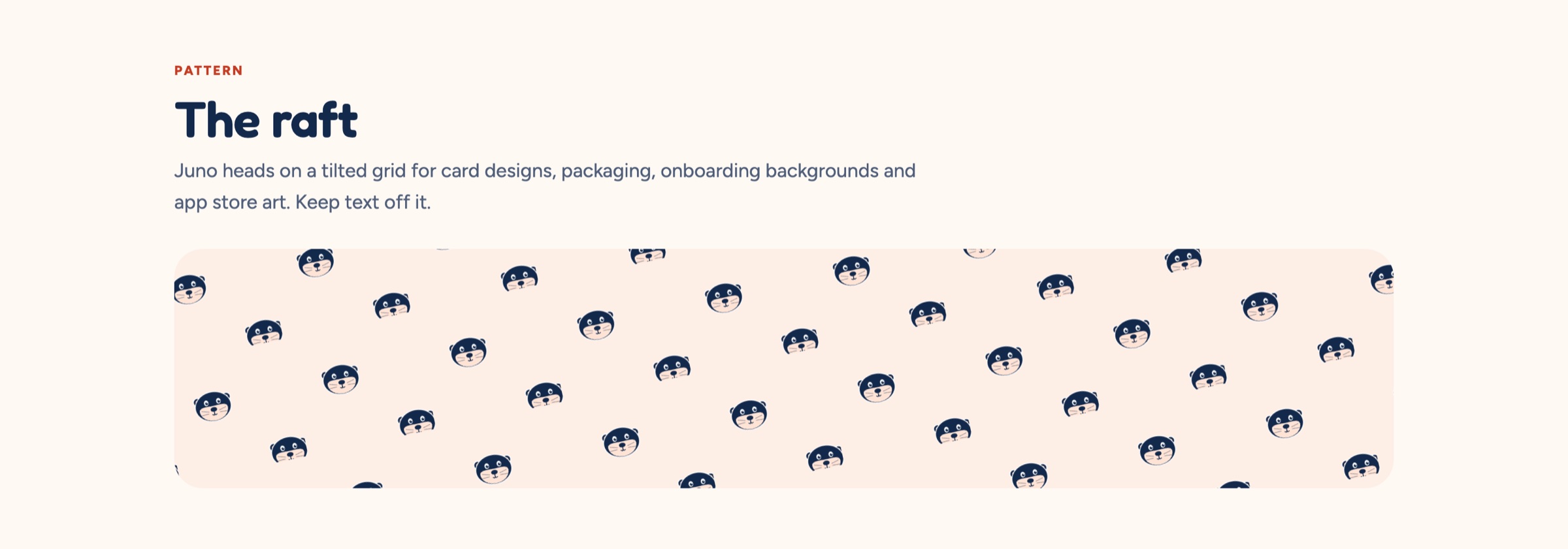
A tilted grid of otter heads for packaging and backgrounds, and a drop-in CSS token file for both themes.